Beauty Brand Identity
Build a brand identity by ‘reverse engineering’,
starting with the actual product, then defining brand attributes,
and finally, develop comprehensive
equity guidelines that travel across various medium.

Original hair and scalp treatment. These colors were integrated into the final design language and identity guidelines
Another designer created the logo and package graphics, without any brand guidelines. The copper represents the vessel that was used to create the ancient formula which was then cooked over an open flame.
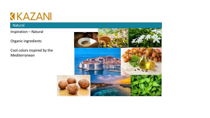
The cool waters of the Mediterranean were the inspiration for the brand equity turquoise color. The third, less important color is gray. This is used only in small amounts, while the copper and blue are the dominant colors.
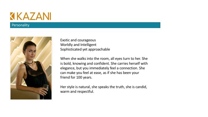
From this, I worked with the client to develop tone of voice, target consumer, brand character, typography style and photography guidelines. I refined the logo and built guidelines for usage, as well as packaging guidelines.
orange blossom
one of the ingredients in the formula and inspiration for the design theme.
All natural and organic herbs, flowers and oils are used in the formula. This inspired the way ingredients were to be portrayed in all touchpoints.
olive oil is a main ingredient in most of the formulas
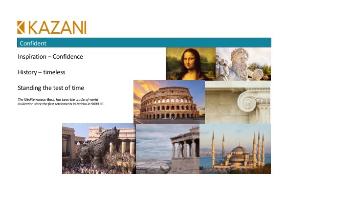
Inspiration: Greek Parthenon - confidence, timeless, stands the test of time.
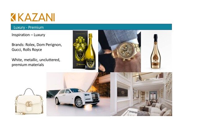
Mood Boards: building the brand character leveraging vivid imagery and defining attributes for a solid identity.
Natural, organic. Mediterranean inspired color palette. Confident. Luxury.


These are the final pages of the Brand Identity Guidelines booklet. It has been shared with the web developer and photographer.


